Designing a Safe Space for Women's Evening Ritual
A romance reading-and-audio app for women — stories in text and audio, built around the 20-minute wind-down ritual before sleep.
1M+downloads — 10× in a year
+14%user retention
+25%daily engagement
+15%session duration
- overview
- 1 year 3 months · Product → Senior Product Designer
- contribution
- Sole product designer for the first 8 months, owning end-to-end UX across two parallel apps — FlingFM (in-app currency) and FreeFM (ad-supported), each testing a different monetisation model. Redesigned onboarding, retention, and content discovery around the evening ritual; later onboarded a second designer.
- team
- Product ownerProduct designer (me)Product designer (joined later)Development teamQA teamMarketing team
Background
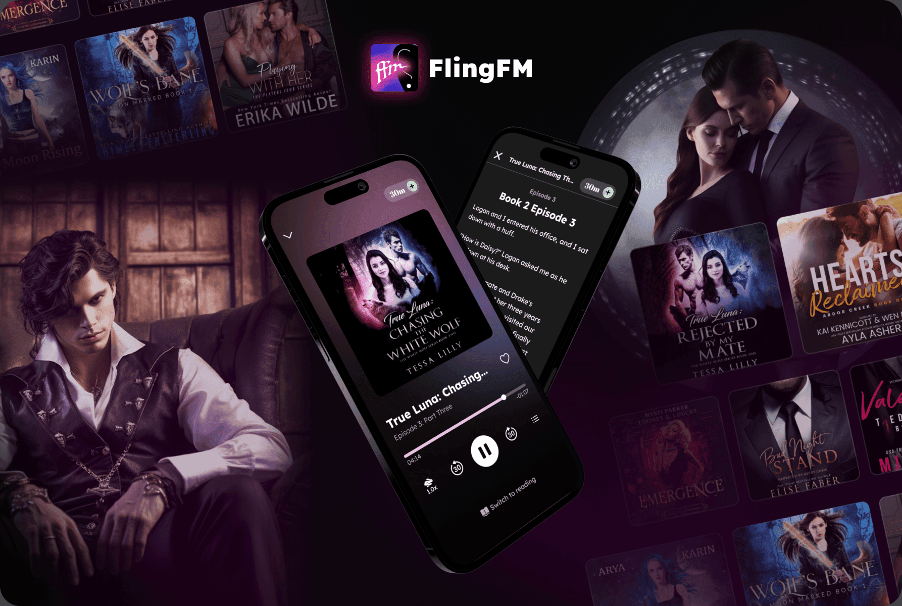
FlingFM is a romance audio and reading app built for women — a personal retreat to unwind with stories from tender romance to steamy fiction, in both text and audio formats.
When I joined, the app had around 100K downloads. For the first 8 months I was the sole product designer, owning end-to-end UX across two parallel apps — FlingFM (in-app currency) and FreeFM (ads) — each testing a different monetisation model. Later, a second designer joined and I onboarded them, sharing context, product knowledge, and established workflows.
My mission: make people stay, come back, and grow the user base.
loading the interface
The Challenge
Users weren't sticking around. Content discovery felt generic, and UX decisions didn't account for the deeply personal nature of how women actually used the app.
How do you design a product that feels like a trusted, personal ritual — not just another content app?
Process
I started by gathering stakeholder interviews, user feedback, store reviews, and product metrics. We used Amplitude for behavioural analytics and internal dashboards for business KPIs — revenue, subscriptions, content performance by cohort.
What the data told us
- ~30% of users dropped off during or right after onboarding — they'd browse briefly and leave without engaging
- Sessions were shorter than target — users who stayed weren't spending enough time to form a habit
- Content abandonment was high — users started stories but didn't come back, pointing to poor content-to-user matching
What users told us
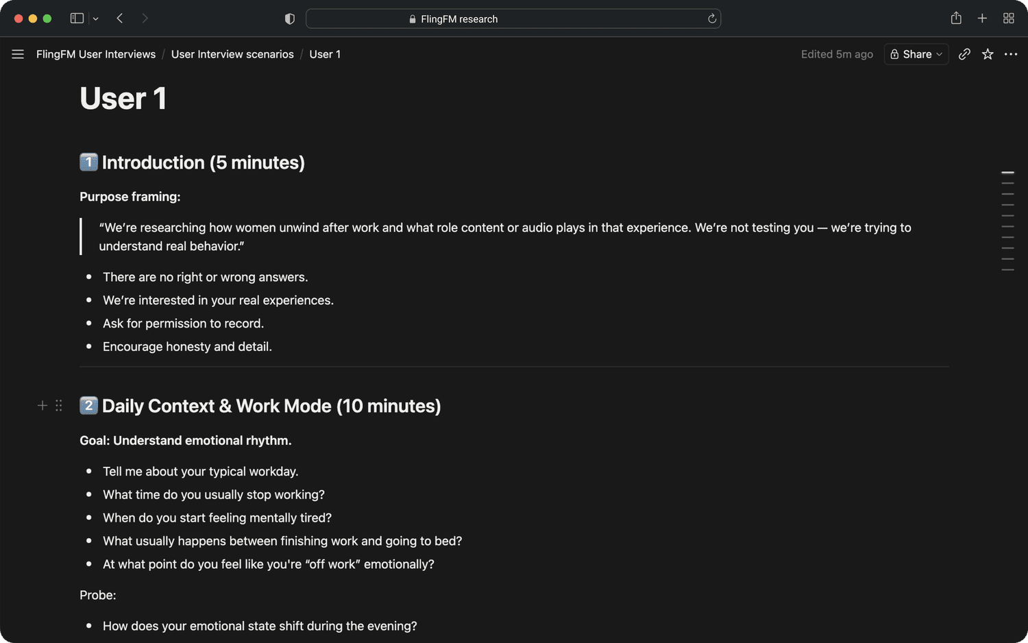
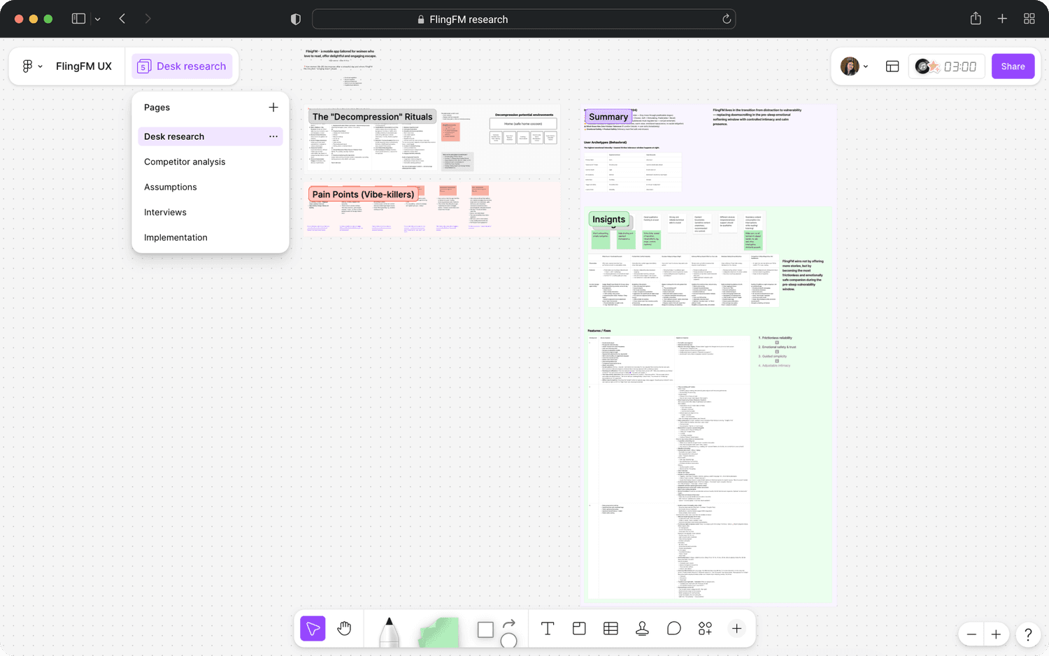
Desk research, competitor analysis, and validation conversations filled in the why. This wasn't just a "reading app." For most users, FlingFM was a wind-down ritual — 20–30 minutes before sleep. That realisation changed everything:
- Pre-sleep is the key moment — the experience had to support that emotional arc
- Friction kills comfort instantly — interruptions feel disproportionately frustrating at night
- Privacy is non-negotiable — discreet notifications and neutral UI increase trust
- Unexpected intensity damages trust — mismatched spiciness means users don't come back
- It's ritual, not completion — users seek controlled emotional closeness, not finishing books
A/B testing as a continuous lens
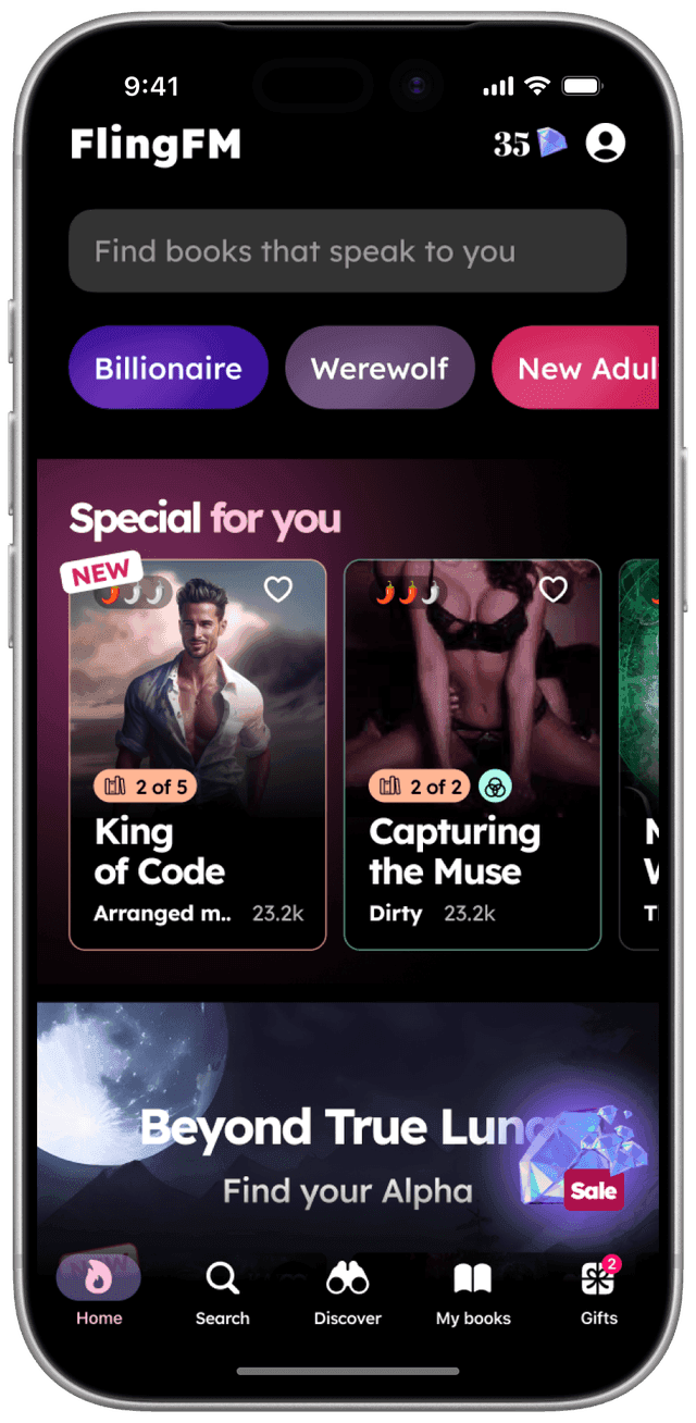
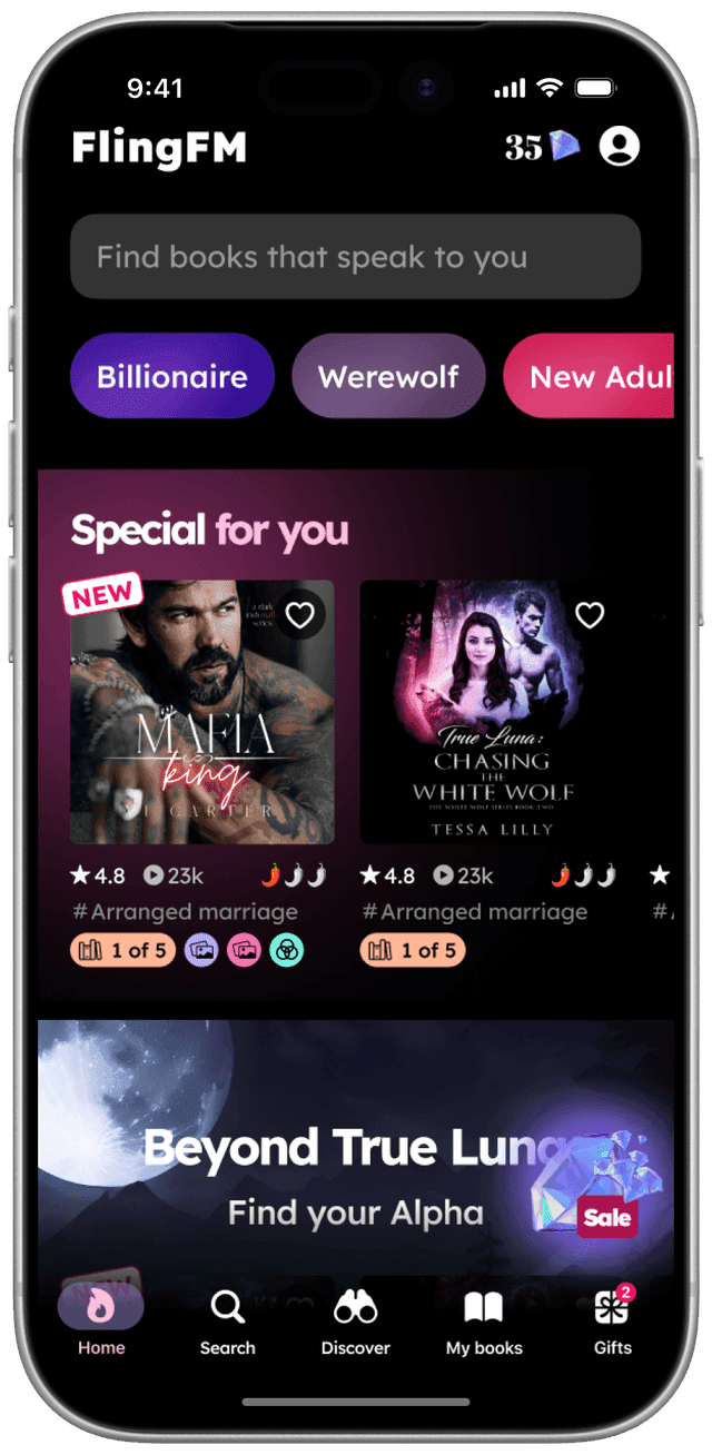
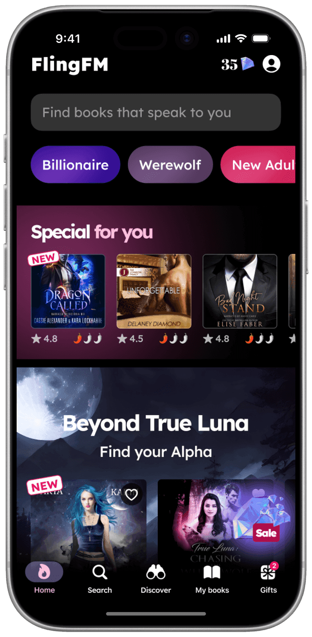
We tested throughout — tabbed home screen vs. unified feed, book cover variations — and compared behavioural data across both apps (retention, session duration, ARPU, churn) to see how monetisation context shaped engagement.
What didn't work
Not every hypothesis survived contact with real users:
- "Chats" with book characters — sounded appealing, but in sessions users found it distracting from their reading ritual
- Mood-based auto-curation ("Play Something Soft") — users rejected it. They wanted low-effort browsing, but they still wanted to choose
- Trope filters / "Not for me" — no measurable retention impact. Liked in concept, unused in practice
These failures taught us: in this domain, agency and control are the product itself.

Solutions
Each feature was a direct response to a confirmed insight.
✶ Reimagined onboarding — 3-step flow: pick themes, choose "spice level," done. Changeable later. First-session engagement improved and early drop-off decreased.
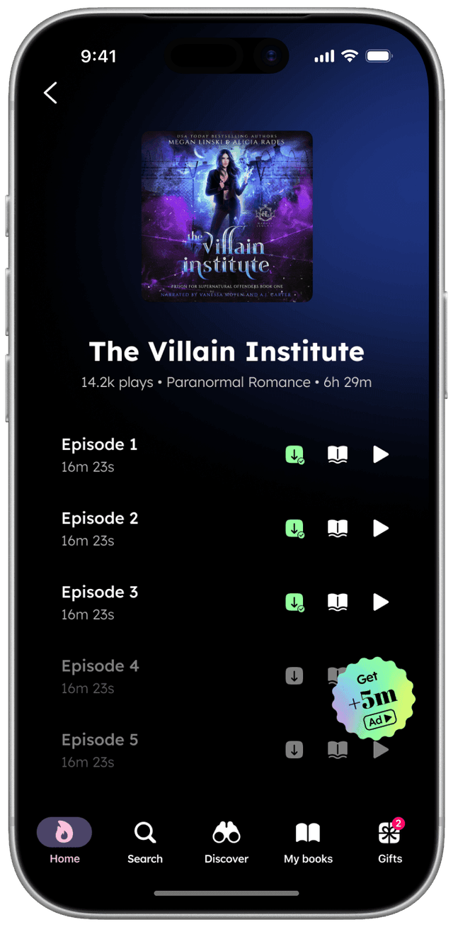
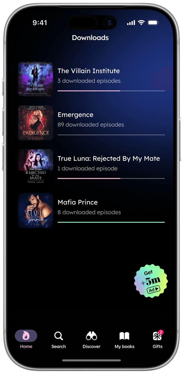
✶ Offline Mode — downloadable content for reading and listening. No more buffering shattering the bedtime atmosphere.
✶ Text-to-Speech dual mode — synced text highlighting with narration, for users too tired to read but wanting to follow along.
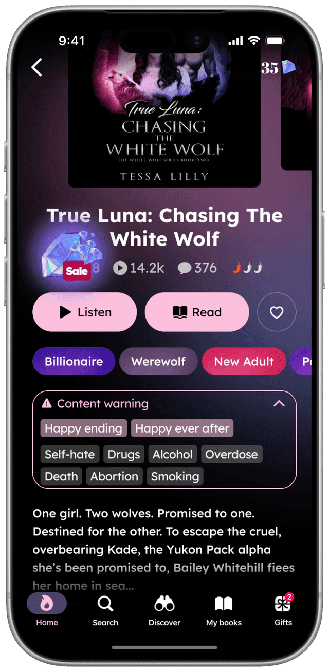
✶ Trigger warnings — content-level warnings in book descriptions. Users stay in control, no trust-breaking surprises.
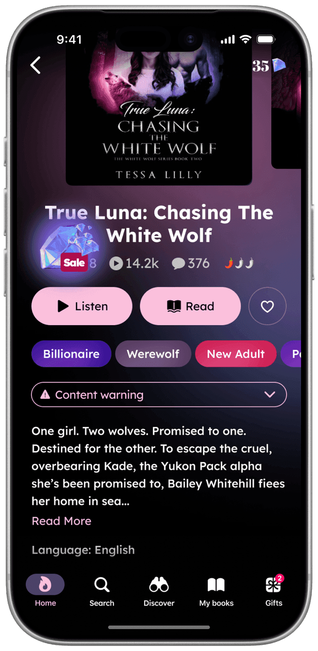
✶ Narrator switching with preview — audio previews before committing to a voice. Like choosing who reads you a bedtime story.
✶ Parent Mode — app lock and neutral push notifications. Mothers could hand their phone to kids without worry.
✶ The tension: UX integrity vs. ad revenue — our foundational principle (no interruptions) directly conflicted with FreeFM's ad model. We iterated: ads only between chapters, skippable formats, buffer screens so transitions felt intentional. A constant negotiation between UX and business — one that never fully resolved, but forced us to be creative about where monetisation could live without breaking trust.
Results
- User retention grew by 14%, daily engagement by 25%, session duration by 15%
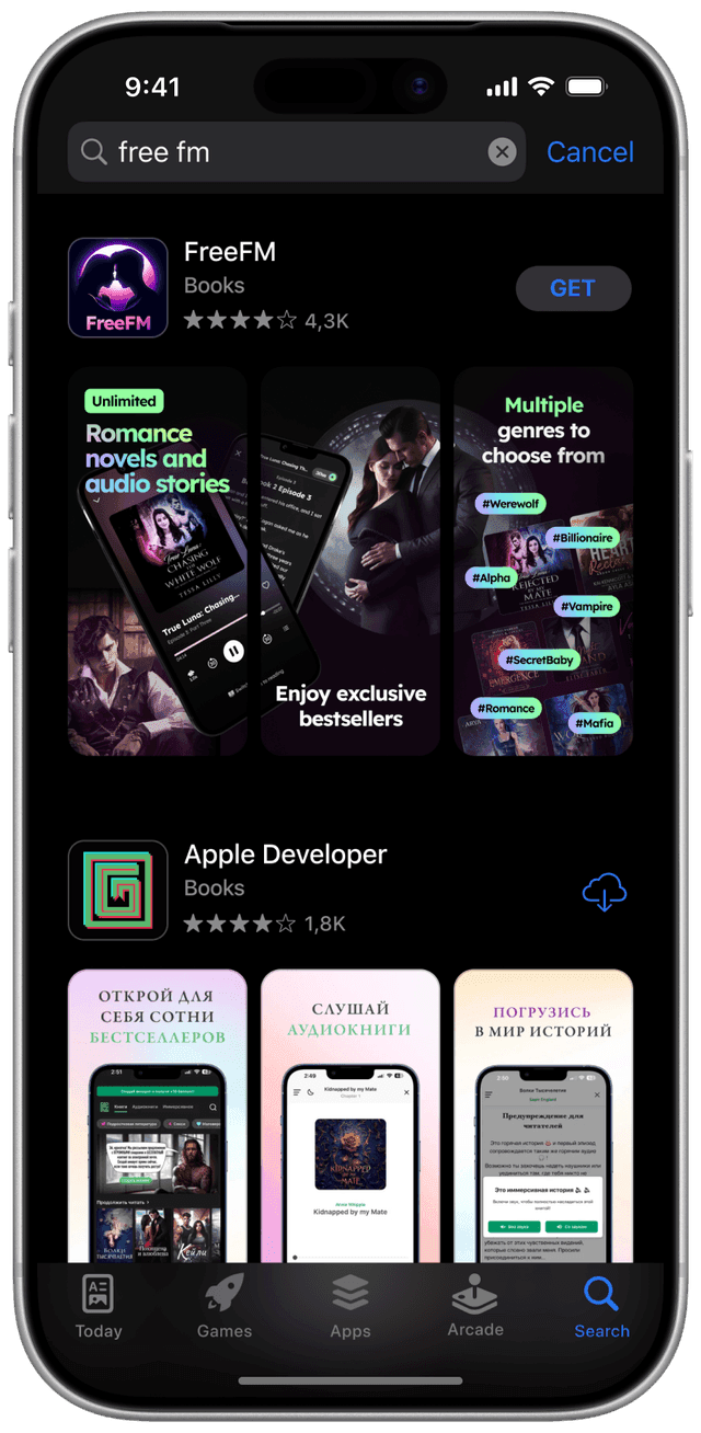
- Monthly downloads rose 22%; redesigned App Store visuals noticeably lifted organic installs
- The app went from ~100K to 1M+ downloads — 10x growth in under a year
Reflection
The best growth strategy turned out to be trust. Trigger warnings and Parent Mode weren't "nice-to-haves" — they were the reason people felt safe enough to stay.
Failed hypotheses sharpened the thinking. Chats and mood-based entry didn't land, but they proved something more useful than a win would have: users wanted control, not automation.
And when and why people use a product matters as much as what they do inside it. Designing for someone winding down at 11pm is a fundamentally different problem from designing for a lunchtime browser.