Designing an AI workforce ecosystem across employee, HR and admin platforms
An AI workforce-intelligence platform — three connected products matching employees to jobs and courses, and giving HR real visibility into the skills they already have.
3platforms shipped — 2 from zero
1,000+enterprise users
150+people at the client all-hands
- overview
- 2 years 3 months · Junior → Product Designer
- contribution
- Built three platforms from near-zero — Skill Passport (employee), Skill Source (HR), Mission Control (admin) — across web and mobile, with no UI kit or prior files. Made the AI's matching reasoning legible, mapped the full hiring workflow with a business analyst, and built a reusable UI kit rebuilt to WCAG AA. Presented the full design work to the client at a 150+ person all-hands.
- team
- 2 product owners (changed mid-project)business analystdesign lead + designers (joined later)product designer (me)development teamproject manager
Background
Large organisations struggle to see what skills they actually have. Employees rarely know what's possible for them inside their own company. This startup set out to fix that — an AI-powered ecosystem matching employees to jobs and courses, giving HR real workforce visibility, and connecting training sponsors to job seekers.
I was the sole designer for 2+ years, covering all three platforms across web and mobile. Two I built from scratch — no UI kit, no prior files, no comparable products to learn from. The third, the admin platform, I inherited and reworked until it belonged to the same system.
loading the interface
The Challenge
The system asked users for a lot before giving anything back. And AI that can't explain itself doesn't get trusted.
- No foundation — no design system, no benchmarks, tight investor deadlines
- Constantly shifting direction — two product owners changed mid-project, priorities reshuffled each time
- Three very different users — one product had to work for employees, HR managers, and admins simultaneously
- Complex AI logic to make human — recommendations existed on the backend; making them feel useful and trustworthy was a design problem
Process
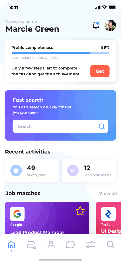
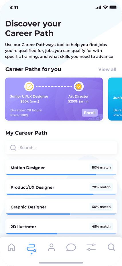
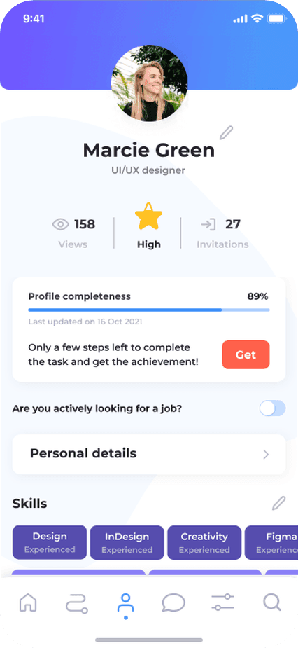
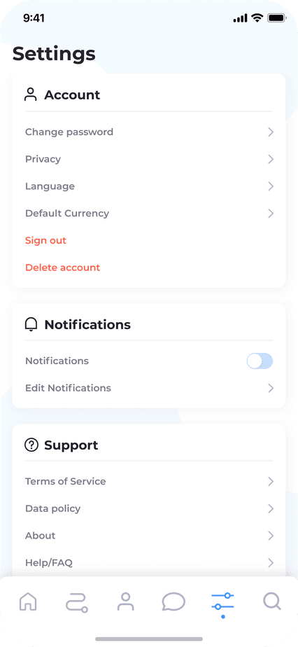
✶ Building an MVP under pressure. The first investor deadline gave us weeks, not months. I had 6 weeks to design the entire employee mobile app from scratch, while the product vision was still being defined — so alongside delivery I was shaping it: researching competitors, studying patterns in similar platforms, and working with the team to define what "good" meant here. No formal research, but enough structure to move fast without guessing. We shipped, and we knew speed had a cost.
loading the screen
loading the screen
loading the screen
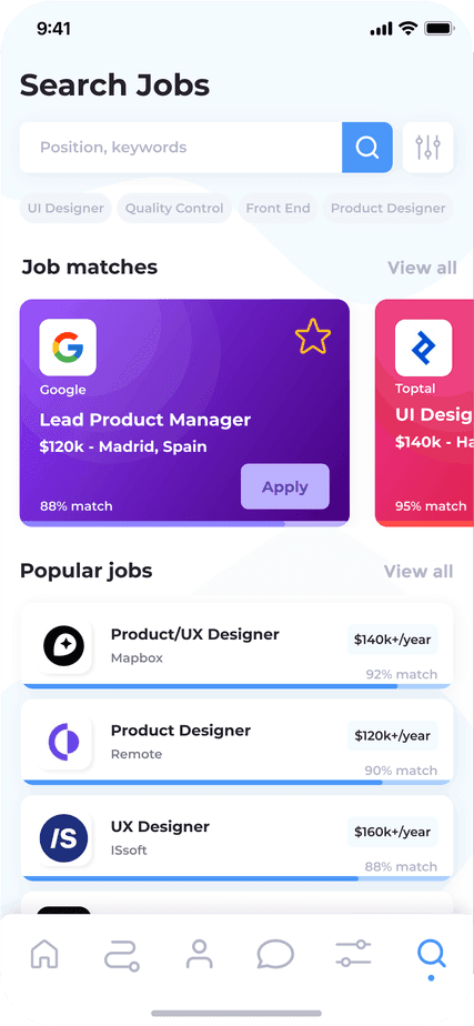
loading the screen
loading the screen
✶ Fixing what rushing had broken. Before moving to web, I ran a heuristic analysis of the mobile MVP and found we hadn't taken accessibility seriously enough. WCAG AA isn't optional in this industry, so it became a non-negotiable fix, carried into every subsequent screen.
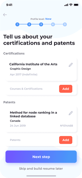
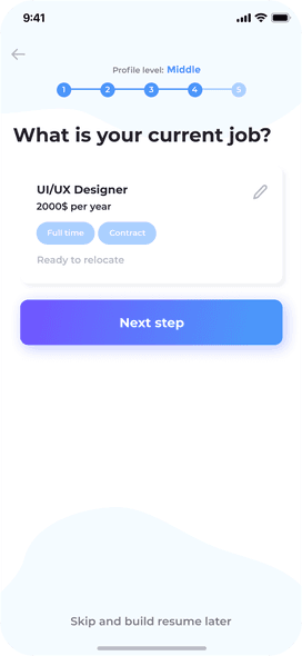
✶ Then, real users. Once the web MVP launched, I ran 6 usability sessions with employees from prospective enterprise clients. The sessions surfaced what no metric could show: users didn't trust the AI recommendations because they didn't understand them. They didn't know why a job was suggested, what the system "saw" in their profile, or how to get better results. The onboarding felt like homework.

SkyHive · web app
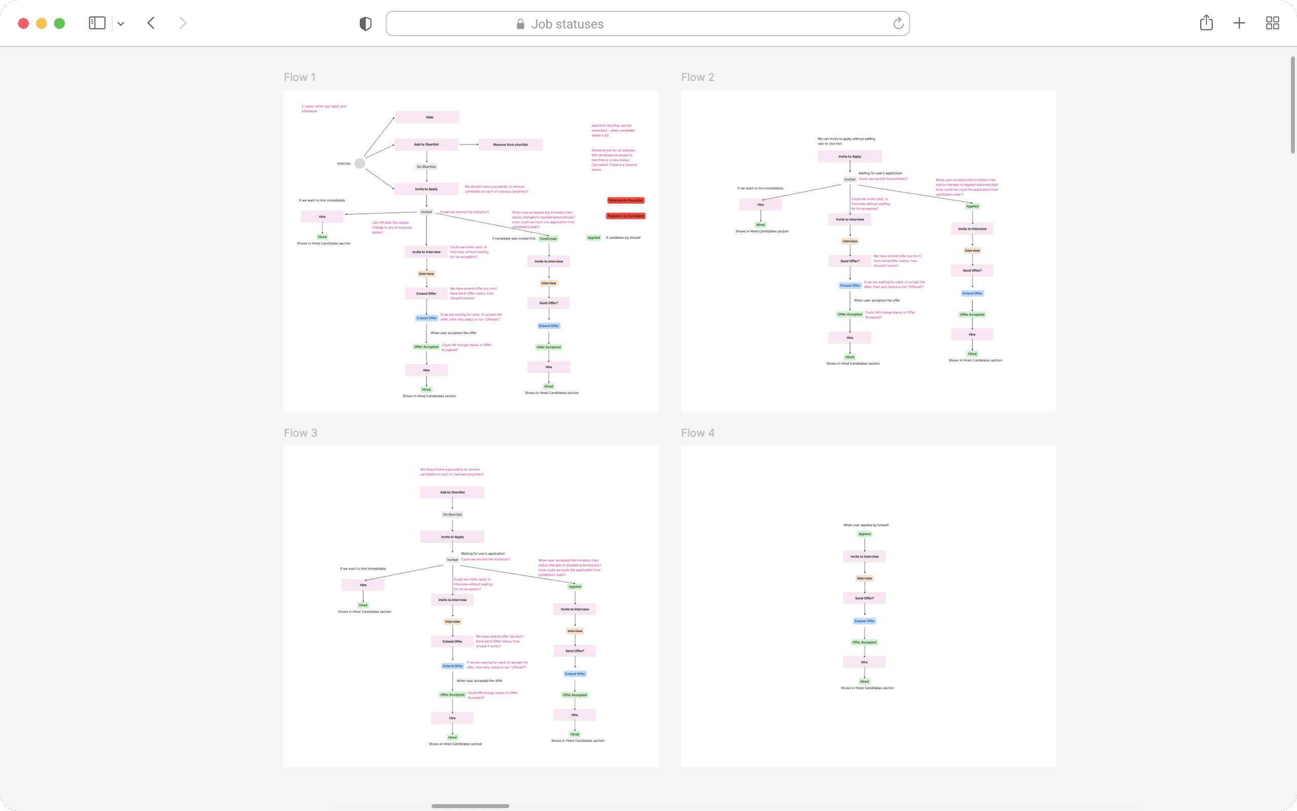
✶ Airtight logic before pixels. Before designing the HR platform, I mapped the full hiring workflow with a business analyst — every status, action, constraint, and edge case — and traced how a single status change cascades across employee, HR, and admin, so nothing broke in the gaps between them.
loading the interface
Solutions
Making AI legible — Skill Passport (employee app)
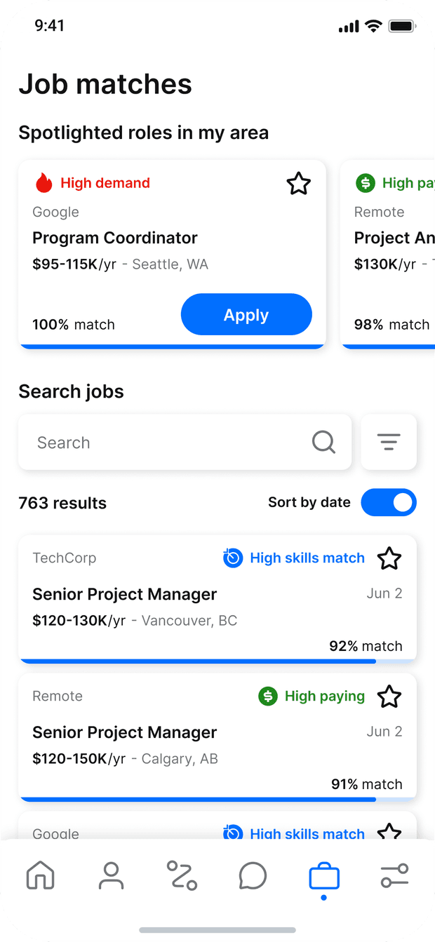
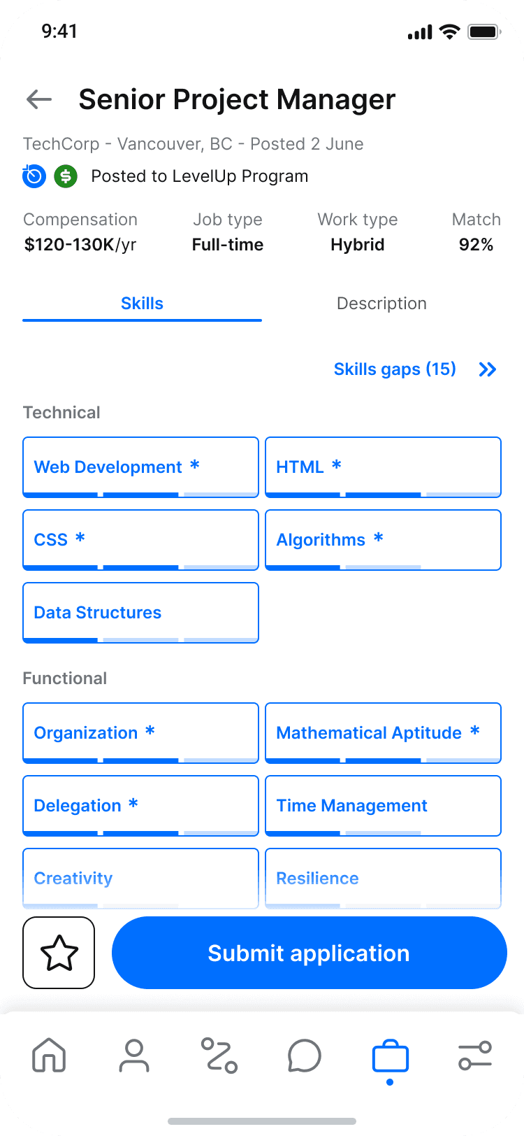
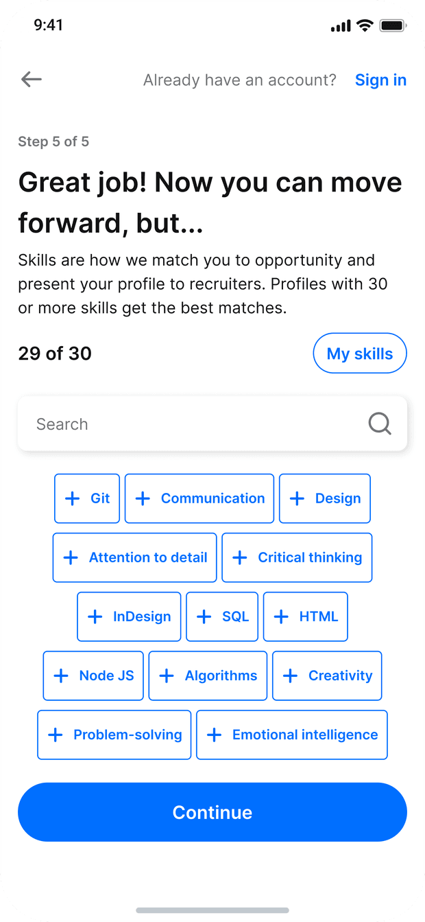
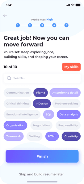
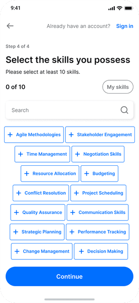
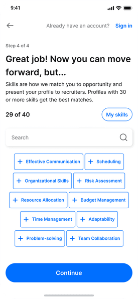
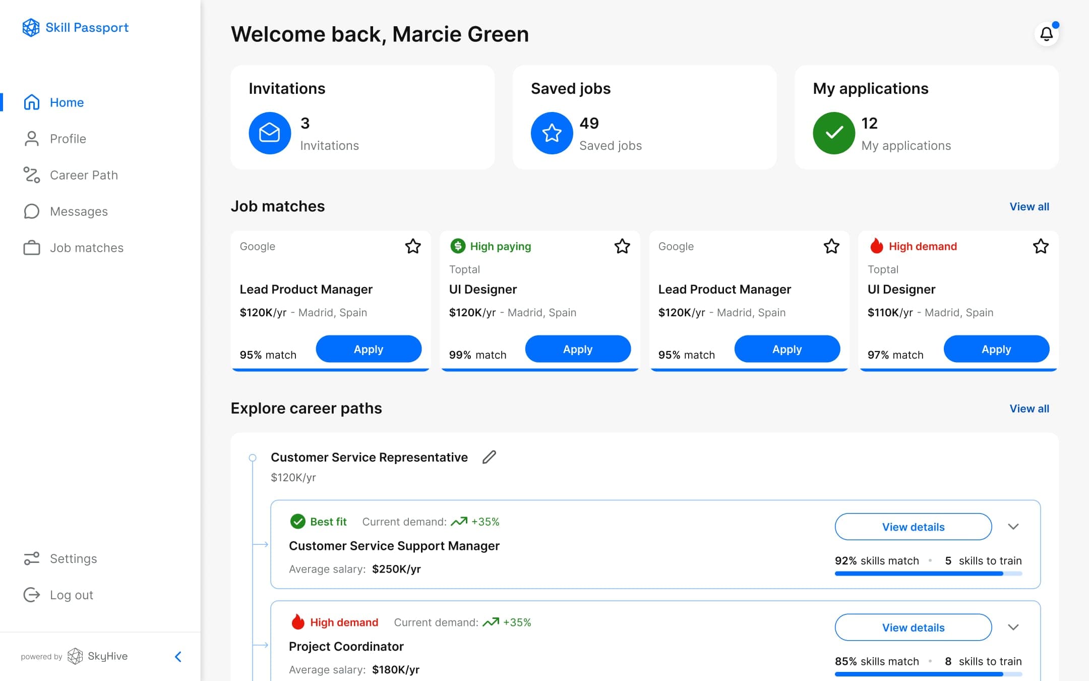
The redesign made the AI's reasoning visible at every touchpoint. Match reasoning moved onto the cards themselves. A Skill Gap view showed exactly where someone stood against a role, making the next step obvious. And a nudge to "add up to 30 skills for better recommendations" made completing a profile feel like improving results, not filling in a form.
- Match reasoning surfaced on every job card
- Skill Gap visualisation — match vs. missing, at a glance
- Job card labels — High Demand · High Paying · High Skills Match
- Anonymous applications — no name, no photo, bias-reduced by default
loading the screen
loading the screen
loading the screen
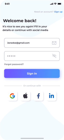
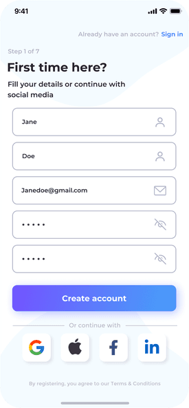
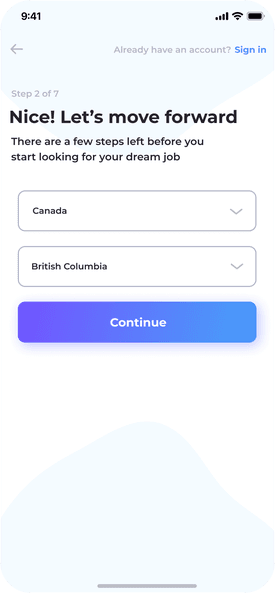
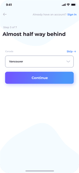
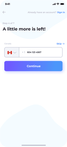
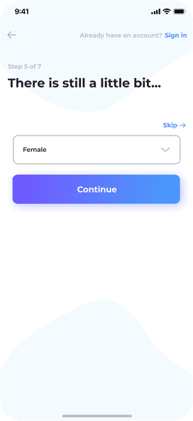
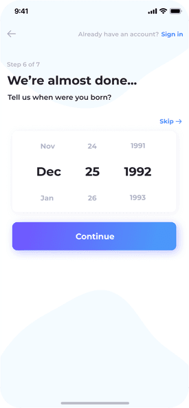
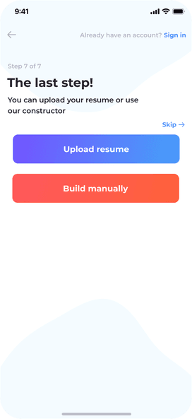
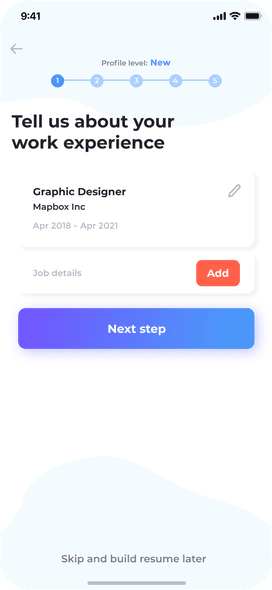
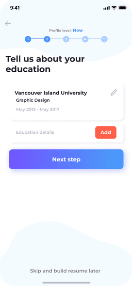
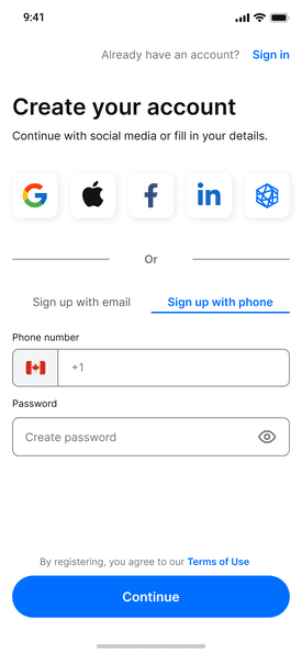
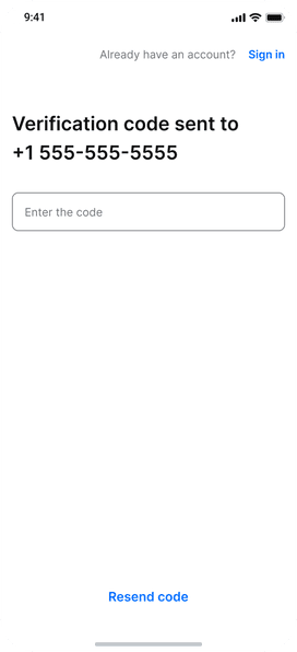
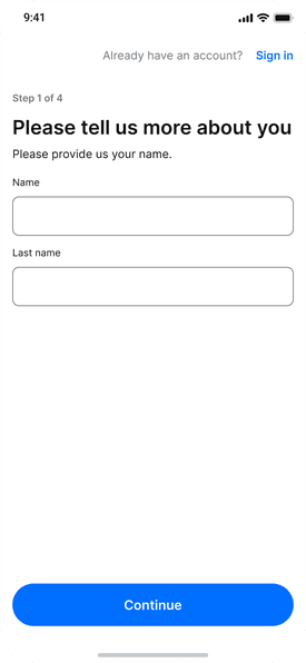
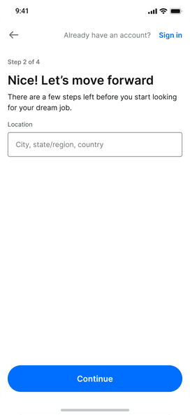
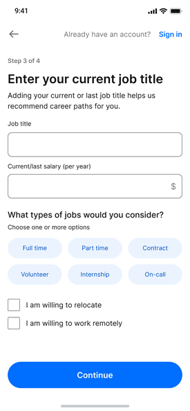
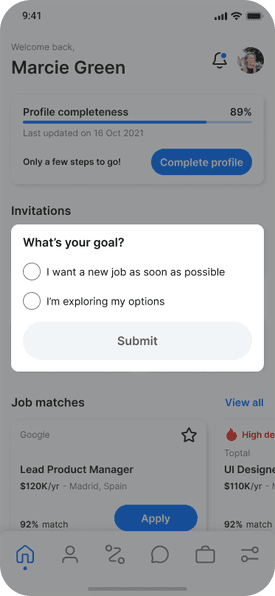
- Progressive onboarding — value before completion, not after
loading the screen
loading the screen
loading the screen
loading the screen
loading the screen
loading the screen
loading the screen
loading the screen
loading the screen
loading the screen
loading the screen
loading the screen
loading the screen
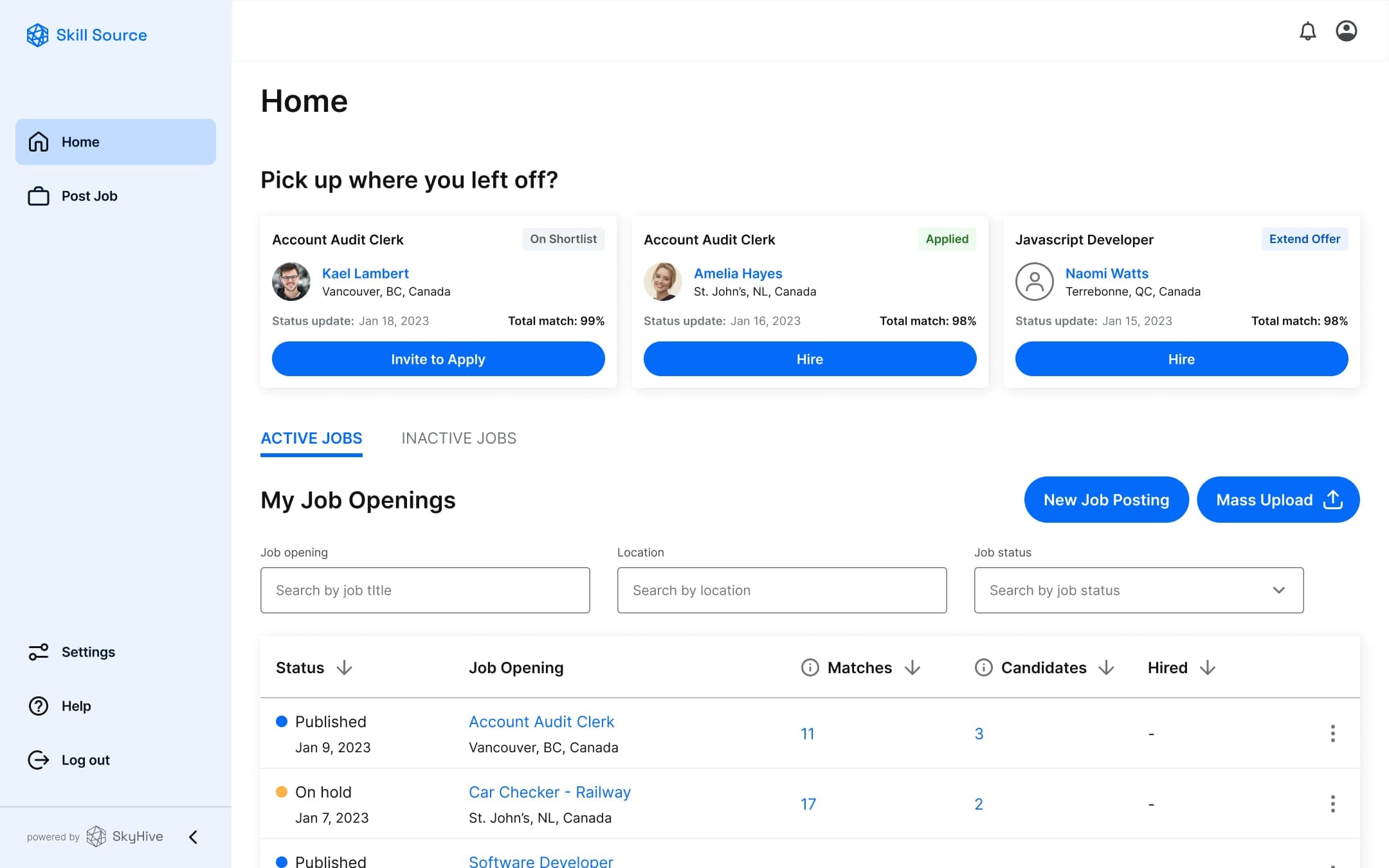
Hiring workflows that mirror real behaviour — Skill Source (HR platform)
The product had to support how HR managers actually work, not how an idealised process would look.
- Vacancy funnel analytics — Matches → Active Candidates → Offers → Hired
- "Pick up where you left off" — last 3 viewed candidates on the home screen
- Candidate hiding toggle — deprioritise without formally declining
- Matches vs. Shortlisted — separate views and analytics per stage
- Cross-vacancy matching in candidate profiles
SkyHive · Skill Source
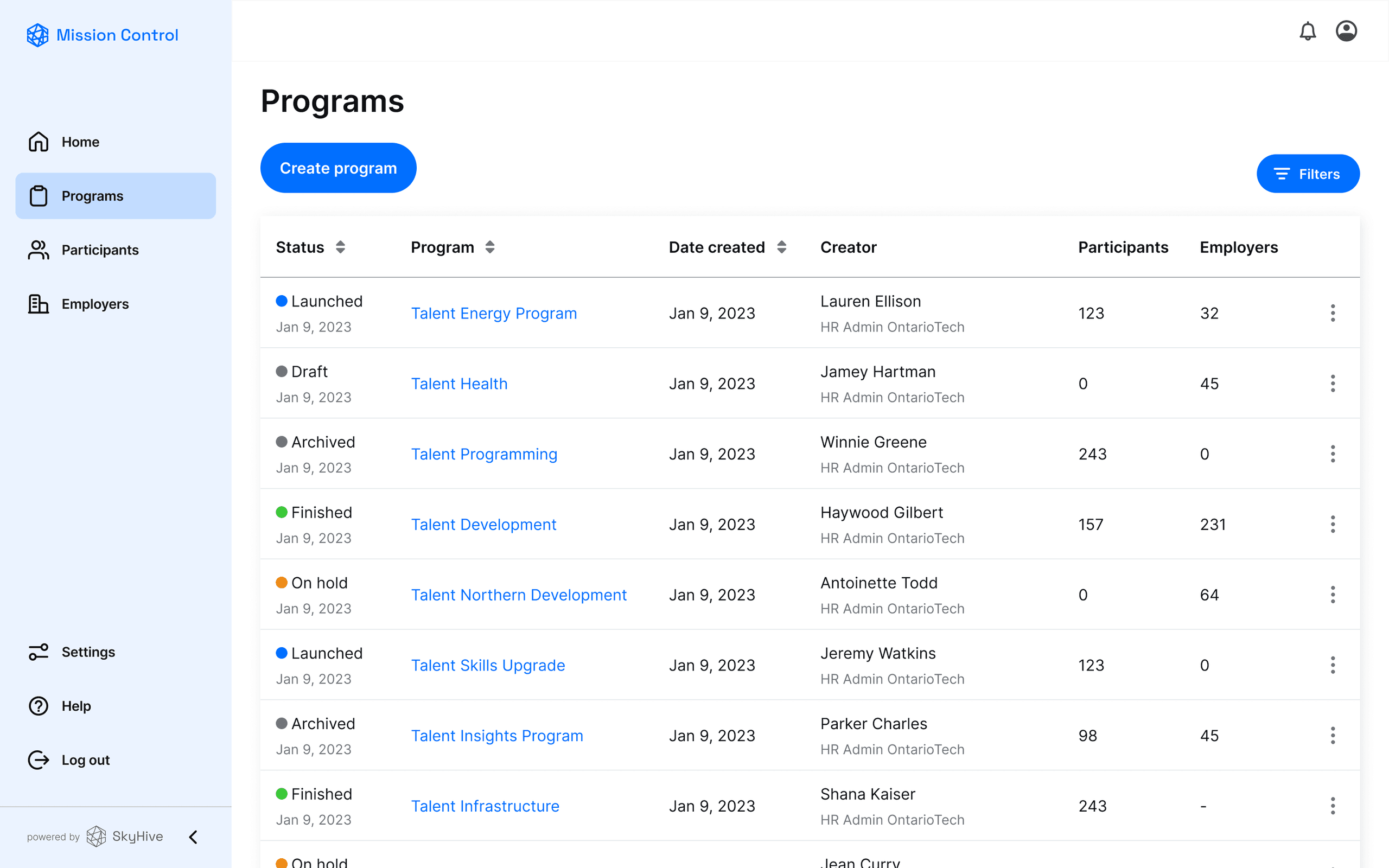
One coherent system — Mission Control (admin platform)
Mission Control already existed, but felt like a different product. I simplified the UI, reworked the programme status logic, and added Participant and Employer profile screens. For the first time, the three platforms felt like one ecosystem.
SkyHive · Mission Control
Results
- 3 platforms shipped — 2 built from scratch, 1 redesigned and aligned to the ecosystem
- Onboarding redesigned — from 5+ forced steps to progressive value delivery
- AI made explainable — users could see why recommendations appeared and how to improve them
- Bias-reduced hiring introduced — anonymous applications across the platform
- Adopted by large corporations, used across enterprise teams (1,000+ users)
- Presented the full body of design work to the client in a remote all-hands with 150+ of their people — walking the org through the problem, the process, and the outcome
SkyHive · Skill Passport
loading the interface
SkyHive · Skill Source
loading the interface
SkyHive · Mission Control
loading the interface
Reflection
An AI recommendation nobody understands is just a guess with better branding. The usability sessions made that concrete: people weren't rejecting the algorithm's answers — they were rejecting being asked to take them on faith.
Making the reasoning visible changed the relationship. Once users could see what the system saw, the same recommendation became something they could act on.
Working alone across three platforms also taught me that consistency isn't a style choice. When one status change has to make sense to an employee, an HR manager, and an admin at the same time, the system has to be right before the screens can be.