Designing trust in digital mental health
An online therapy platform connecting people with licensed psychologists over chat and video — no waitlist, no commute, about half the cost of traditional therapy.
5platforms designed solo
2.5 yrssole product designer
2languages — de & en
de / atlive markets
- overview
- 2 years 3 months · Junior → Product Designer · Sole Designer
- contribution
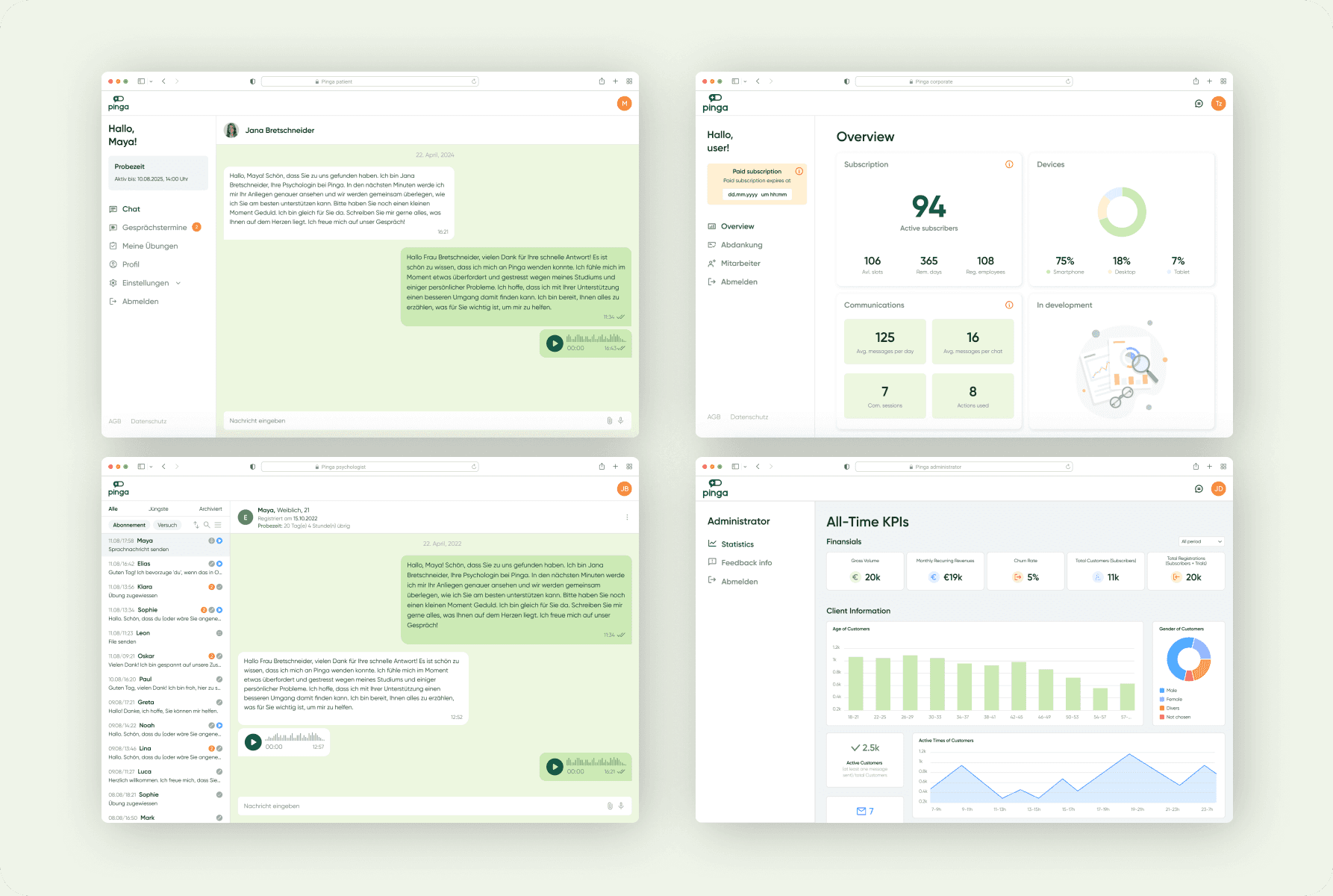
- Sole designer across five product areas — landing, patient app, psychologist workspace, corporate role, admin dashboard — on web and mobile (Flutter), localised for German and English. Reverse-engineered the live product into a reusable UI kit from zero, redesigned onboarding around emotional safety, and rewrote subscription and cancellation logic for transparency over pressure.
- team
- project managerproduct designer (me)business analysts (x2)development team (Flutter / web)QA team
Background
Pinga connects patients with its own vetted, licensed psychologists via chat and video — no waitlist, no commute, at roughly half the cost of traditional therapy.
When I joined, the platform already existed. People could register, chat, book sessions. But something wasn't working — users hesitated, dropped during registration, and weren't sure what they were paying for. In mental health, hesitation means leaving.
For 2.5 years as the sole product designer, I covered the full product: landing page, patient platform, psychologist workspace, corporate role, and admin analytics dashboard.
loading the interface
The Challenge
The product was asking for commitment before earning trust.
- Long, friction-heavy onboarding — users dropped before seeing any value
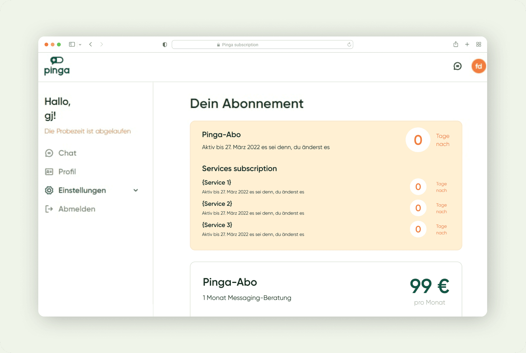
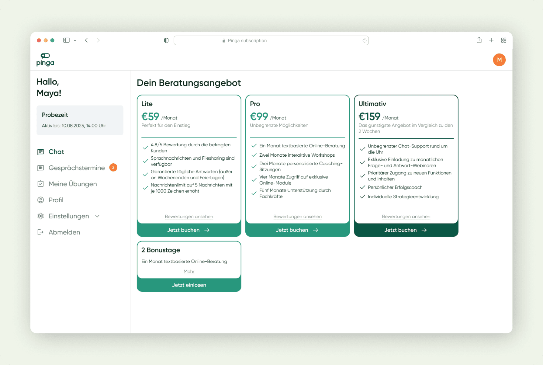
- Confusing subscription model — unclear limits, hidden cancellation, too many plan tiers
- No emotional safety — transactional tone in a deeply sensitive domain
- No foundation to build on — no design system, no source files, legacy code, bilingual complexity (DE/EN)
loading the interface
Process
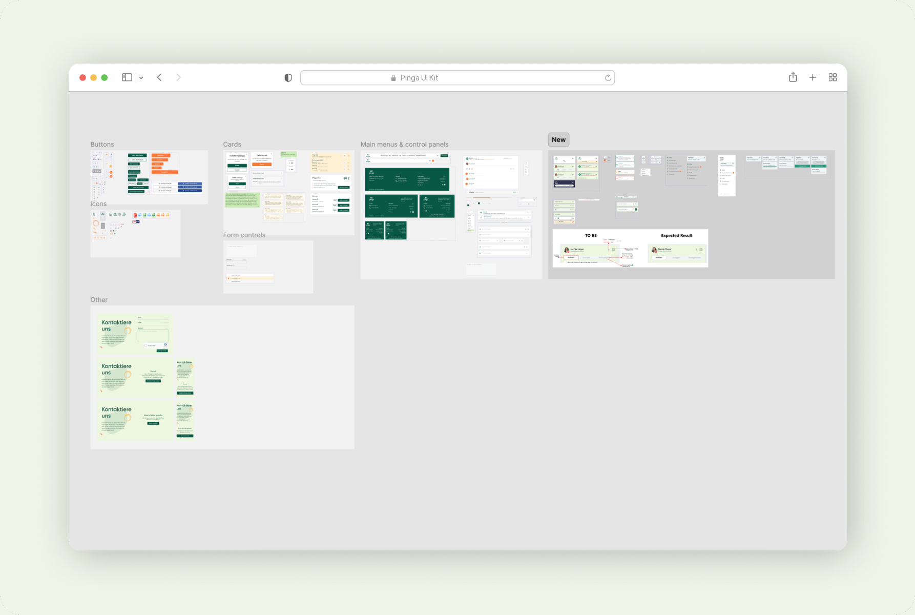
✶ Built the foundation from scratch. No source files, no components. I reverse-engineered the live product and built a full design system from zero, covering web and mobile (Flutter), localised for both German and English.
✶ Read the metrics instead of running formal research. With no dedicated research time, I worked with heuristic analysis, competitive benchmarking, and close collaboration with the PM and business analysts to understand where users dropped off and why.
✶ Advocated for users in every sprint. Without a researcher, I flagged dark patterns, pushed back on pressure-driven decisions, and consistently argued for trust over conversion — especially critical in a mental health context.
✶ I tracked the full journey and targeted each friction point in turn: Visitor → Registration → Trial → Payment → First Chat → Ongoing Sessions → Retention.
loading the interface
Solutions
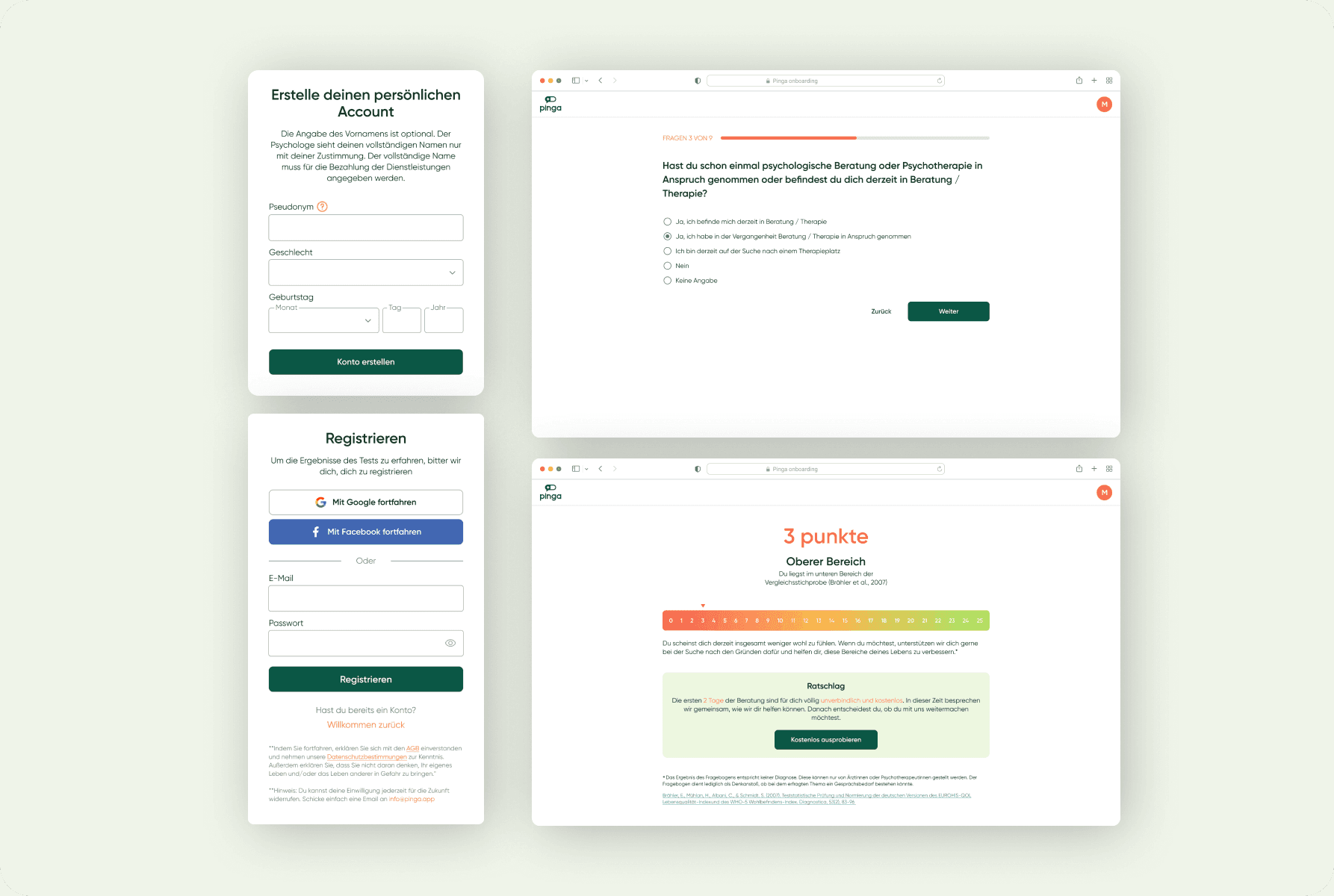
✶ Redesigned onboarding around emotional safety. Shifted the experience from “sign up and commit” to “start safely and explore.” Reduced required fields, added an immediate value moment (a short wellbeing check-in leading to psychologist matching), introduced Anonymous Mode, and surfaced trial and cancellation logic upfront.
loading the interface
✶ Made trust a structural principle, not a visual detail. Rewrote plan comparison logic, clarified usage limits, simplified cancellation, and shifted the tone across all key decision screens to be calmer, clearer, more human.
loading the interface
✶ Strengthened retention between sessions. Retention happens between therapy sessions, not during them. For patients: audio messages, file attachments, session scheduling, therapist-assigned exercises (relaxation, reflection, meditation). For psychologists: private notes, session planning tools, reusable welcome templates, welcome video.

Pinga · task assignment
Results
- Product live at pinga.app across Germany and Austria
- 5 platforms designed end-to-end as a solo designer
- Lower-friction onboarding — clearer entry, faster path to the first psychologist conversation
- Transparent subscription logic — simplified plans, visible limits, honest cancellation flow
- Richer therapist–patient interaction — from a chat tool to an ongoing support environment
- Scalable design foundation built from scratch across web, mobile, and two languages
loading the interface
Reflection
In a sensitive domain, clarity drives growth. Trust isn't a visual detail — it's a retention strategy.
The hardest conversations on this project weren't about layouts. They were about whether to make cancellation easy, whether to show the real limits of a plan, whether a person in distress should have to give their name before they get any help. Every time we chose transparency, the product got slower to convert and better at keeping people.
Pinga · landing page